Dear Debbie:
We are renovating our bathroom, replacing the bathtub with a shower that has easy access. We’ve looked at acrylic shower inserts but prefer the look of marble. What are your thoughts on acrylic vs other types? Thank you.
— John
Dear John;
There are so many imaginative ways to renovate today. How much you want to spend is perhaps the first consideration. Acrylic is an inexpensive choice that is easy to keep clean. But it sounds like you would like a material that has a richer look. Porcelain tiles may be your answer. They are hygienic, easy to clean and longlasting.
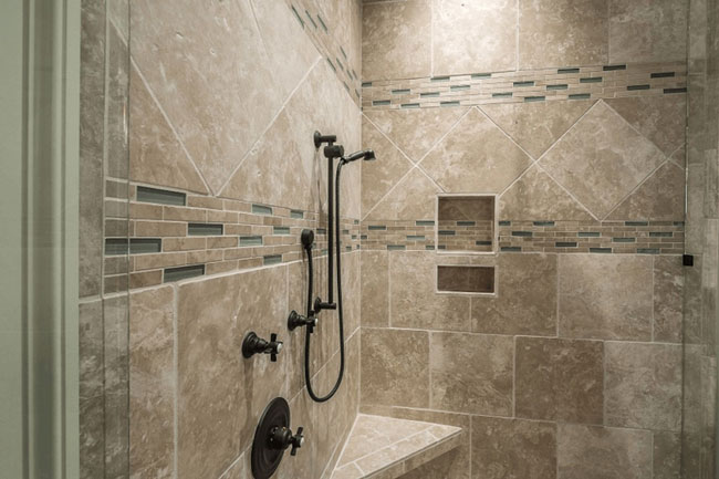
Build your new shower space with safety in mind. The vast selection of shapes, designs and finishes in the tile market supply all the options you require. For the shower floor choose a mosaic tile with matte finish. Lots of grout around these tiles create a slip-resistant surface. For the walls, coordinating tile shapes and sizes makes it easy to customize your look. For the main field select flat tiles in larger size — they are available in marble and stone finishes and not too costly. Then intersperse accent tiles as a border or accent for the shower niches that hold soap and other bathing products. You can even tile the ceiling. Accent tiles add glamour and character. Look for colourful glass tiles, glittering iridescents, rippled textures that imitate water, and tiles that replicate the look of stone or wood.
This shower from whytile.com shows contemporary stone-look square tiles laid in an off-center grid. The accent bands incorporate even more geometric fun with the pattern continued inside the niche. This is a complex design that takes a talented hand to create and build, but it is inspiring. Enjoy your planning.
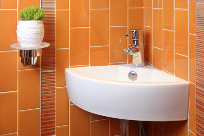
Dear Debbie;
I was looking for some colour inspiration as I searched through ideas for renovating a small bathroom that was originally a hall closet. The small space had no window and a low ceiling. Orange is one of my favourite colours, but is it too strong for this room? I have always liked your colour advice.
— Adrianna
Dear Adrianna;
Orange is a happy colour. It is a combination of two primary colours, red and yellow, that merges the energy and fiery sprit of red with yellow’s bright and cheerful nature. Orange promotes a sense of wellbeing and warmth, a very social shade. It’s an attention seeker, but in a good way, known to rejuvenate and help us look on the bright side of life. With the turmoil going on around us these days, we should all have a splash of this uplifting colour somewhere in our homes.
You can simply paint the walls in a solid coat. Or pick a wallpaper pattern that has orange and pink flowers, large or small. Powerful colours need some kind of contrast to balance out their boldness. Add a pale blue stripe or border, hang black and white artwork, and since you have no window what about a bit of artificial greenery. Tiles are another option and having rectangular tiles running vertically will lift the ceiling. Accent tiles plus the white grout and sink create a joyful balance. Hand towels are a final decorative addition that are easily switched when the spirit moves you.