Red is a fascinating colour. Its moods are as diverse as its many shades and tones. Scarlet is bold and sexy, heightened if applied with a glossy finish. Reds with an earthier, brown tone are warm and have the feeling of country in them, think barn red. Pinky reds are often playful and young at heart like candy, fun for kids’ rooms. When red is paired with other colours it makes a grand statement.
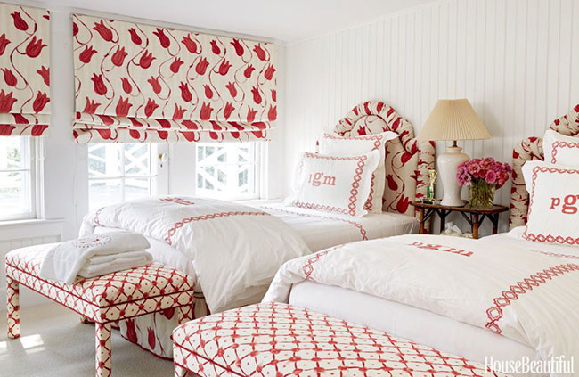
If you are drawn to its refreshing character but not sure how to inject it into your décor, begin with a neutral background and add a selection of reds in fabric patterns for draperies, bed linens, a carpet, a lamp base or two and picture frames. These touches of red contrast beautifully against a white background. As seen here Lisa McFadden used two lively fabric patterns from Designers Guild to infuse colour into an all-white bedroom, giving the room a fresh, morning glow that will cheer you on the gloomiest days of winter.
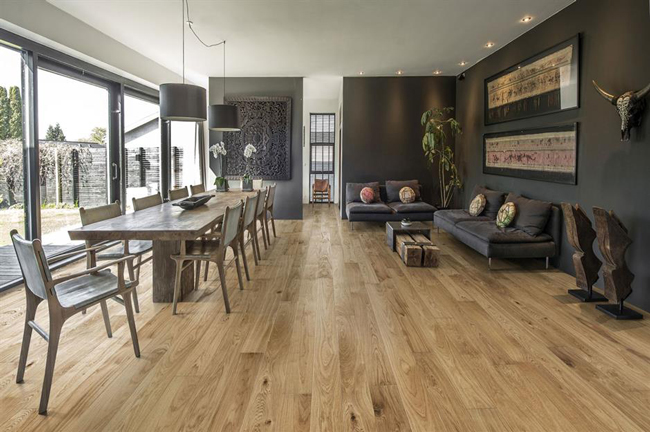
Traditional wood tones have always been paired with red. The deep, rich tones and natural grains of wood for wall panels, doors, trim and floors are reminiscent of Century homes. Historically, wine reds were used in the dining rooms and boudoirs to create a theatrical setting. Jewel tone blues, greens and gold were introduced to maximize the plush, extravagant atmosphere. These elements are used in today’s homes, contemporized by lightening the wood and choosing the same colours but brightened them up. A gloss finish, a modern pattern or a new piece of furniture will change the era, but not the stunning appearance.
Homes with a country vibe are very tuned into red. Taking a cue from nature, the yellowish red of poppies and the burnished red of autumn leaves are perfect complements to light woods such as maple and pine and comfy, practical seating upholstery. Rag rugs, kitchen café curtains, and floral wallpaper prints in saturated tones bring life and whimsy to neutral backgrounds. If you are reluctant to use big splashes, try a touch of red in each room. The theme will unify your living spaces without overpowering them. And it’s always easy to add more once you witness the positive change. This is true for any decorating steps. It’s wise to start slow and build.
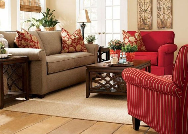
The living room seen here has a warm neutral base of creamy beiges and mid-tone browns. The walls, floor and sofa are calm, window blinds, artwork and plants are natural and the coffee table is a darker brown. And then there are the chairs, oversized and covered with a red that looks as though it has bloomed out of the surrounding browns. This is exciting. What a difference it makes to the overall mood of the room. A change from bland to captivating.
Play around with texture as well as colour. Deep reds are more intimate as they absorb light as do nubbly or shaggy fabrics. Matte finishes for paint and fabric have the same effect. If you are looking to energize, go for orangy reds and glossy finishes. A high sheen lamp base or vase, a selection of shiny leather or fabric cushions, or a bold backdrop behind a bookshelf in this intense red is modern and youthful. No matter where on the spectrum you decide to go, red won’t disappoint you. It has built-in character to burn!