Whether you are decorating one room or have decided to do an all-out renewal, it’s important to have an eye for how your choices flow and blend from one room to the next. There are so many ways to paint a room. Do you accent the woodwork, what about the doors, can you put more than one colour on the walls, can you change the mood from calm to dramatic from one room to the next? You might be surprised to hear that you instinctively know most of the answers to these questions. You are naturally drawn to certain colours and moods. That should be your first guide.
When you begin your adventure, it’s a great time to get inspired by the wealth of photographs and design trends to give you an idea of what amazing results can be accomplished. An excellent source I discovered is Farrow & Ball’s new book, Recipes for Decorating. Farrow & Ball have an inspired colour selection of paint and wallpaper crafted over 70 years of experience. They are renowned for their historical palettes as well as the purity of their colours drawn from nature. Joa Studholme has been their Colour Curator for 23 years and brings her extensive experience in selecting colours and decorating to the stunning rooms shown in the book. Studholme offers tips and tricks along the way as she demonstrates different approaches to setting up a home’s palette.
As per the title, the author thinks of decorating in terms of cooking and enjoys using culinary elements to explain the connections she sees between creating a memorable meal and putting a home together. Style, flow and light are main ingredients. For style Studholme advises to let your personality be your guide, that, and how you want to feel when you are in that room. Flow is very important for balance. You want to be able to move effortlessly through your home, not feeling jarred or overpowered as you go from one room to the next. Light shifts throughout the seasons and the days and paint colours change in different light conditions. You may have noticed that the same colour on all the walls in a room looks lighter or darker depending on the angle of light striking it.
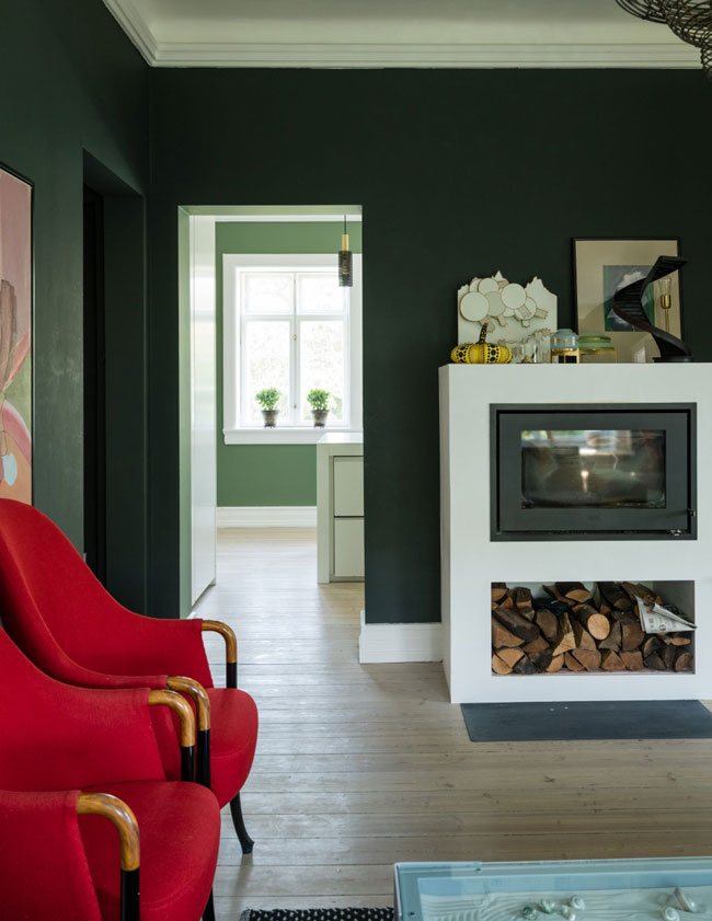
“Start by choosing a colour for the hall as this is the most important space for establishing a sense of flow”, says Studholme. “This colour can unify the house because it is visible from the greatest number of rooms.” Continuing the flow, where do you most often go next? If it’s the kitchen, make it light and it will have a natural gravitational pull. Rooms can happily have separate colours as long as they complement each other. Shown here, the flow from clubby Studio Green in the sitting room to lighter Calke Green in the kitchen makes each room feel inviting and connected, unified by an All White trim.
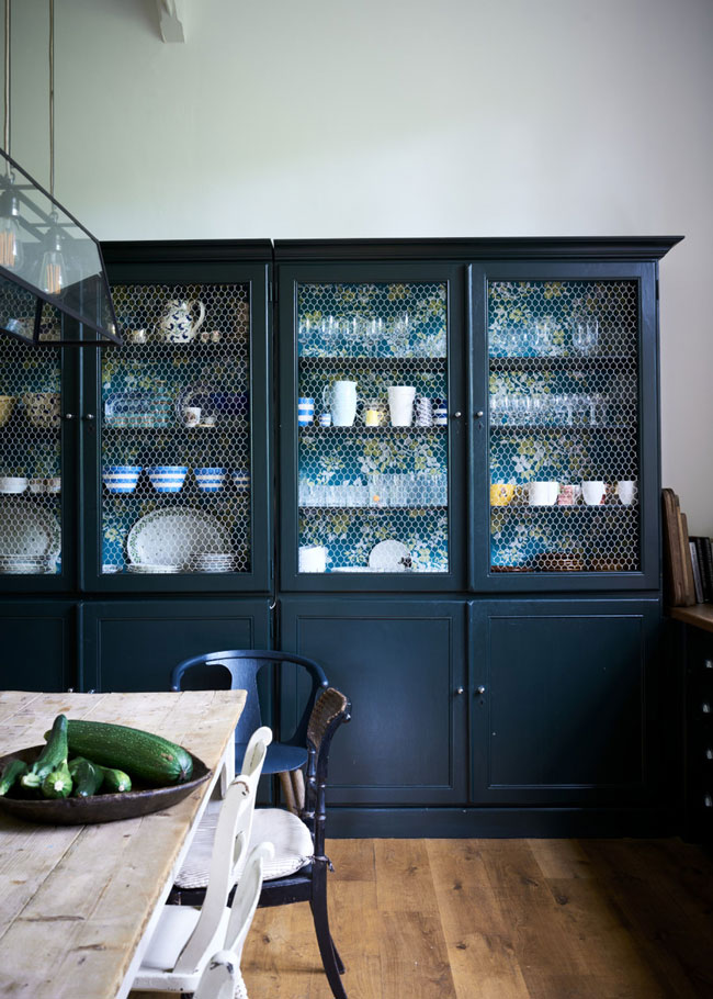
Colour flow can be drawn from furnishings and wallpapers as well as wall paint. The inside back of a large chest that holds kitchen crockery is papered in Hegemone. The colours in the pattern reflect the colours in both the boot room and kitchen window recess (not shown).
Tried and tested recipes for halls, kitchens, sitting rooms, bedrooms, bathrooms, cloakrooms and children’s bedrooms are laid out as table settings, a fun way to visualize your favourite combinations. Hundreds of photographs of welcoming rooms in historic and modern styles show off the brilliance of paint and all it can do to create a room to your liking.